
#19 The Framework I Use to Build Photosets
Pre- and Post-Production: The Method Behind My Photosets

In this issue, there’s something I want to share. For some time, I’ve battled a creative struggle—one of what makes up the perfect photoset. If we ask five people, each would have differing opinions, but where I fell short was not in the photos themselves, but in piecing the puzzle together. I kept asking myself: what’s the recipe to make the set compelling and engaging?
Sure, we can all put photos on a webpage, but one thing I’m firm on is this: is the story moving forward? If the struggle wasn’t in the photos as single images, was I falling short in the pre-planning?
What I did find out is this: the framework will not only change how you sort your sets in post, but also how you plan and shoot in the field. I went about defining this struggle using the framework, experimenting and tweaking over a series of months—piecing together old traits and breaking into new habits. In doing so, I think I’ve streamlined it enough to want to share it as a useful pre- and post-production tool for use on your own sets.
The Photoset Framework.
Cohesive sets that flow, not just moments. Here’s the method I’ve built to make that happen.
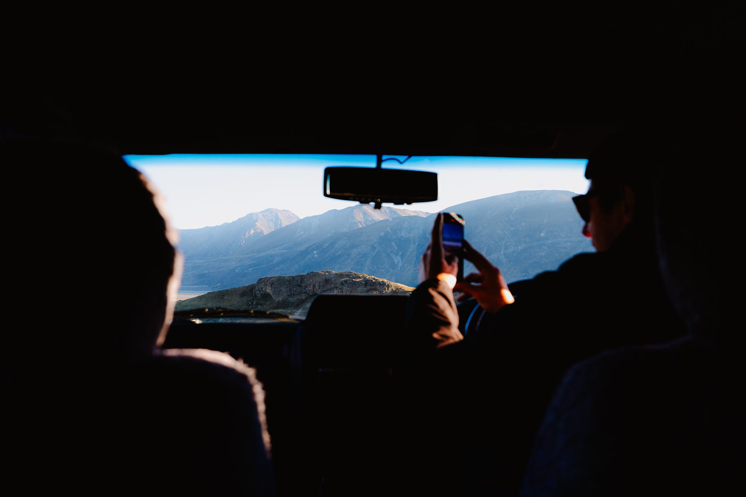
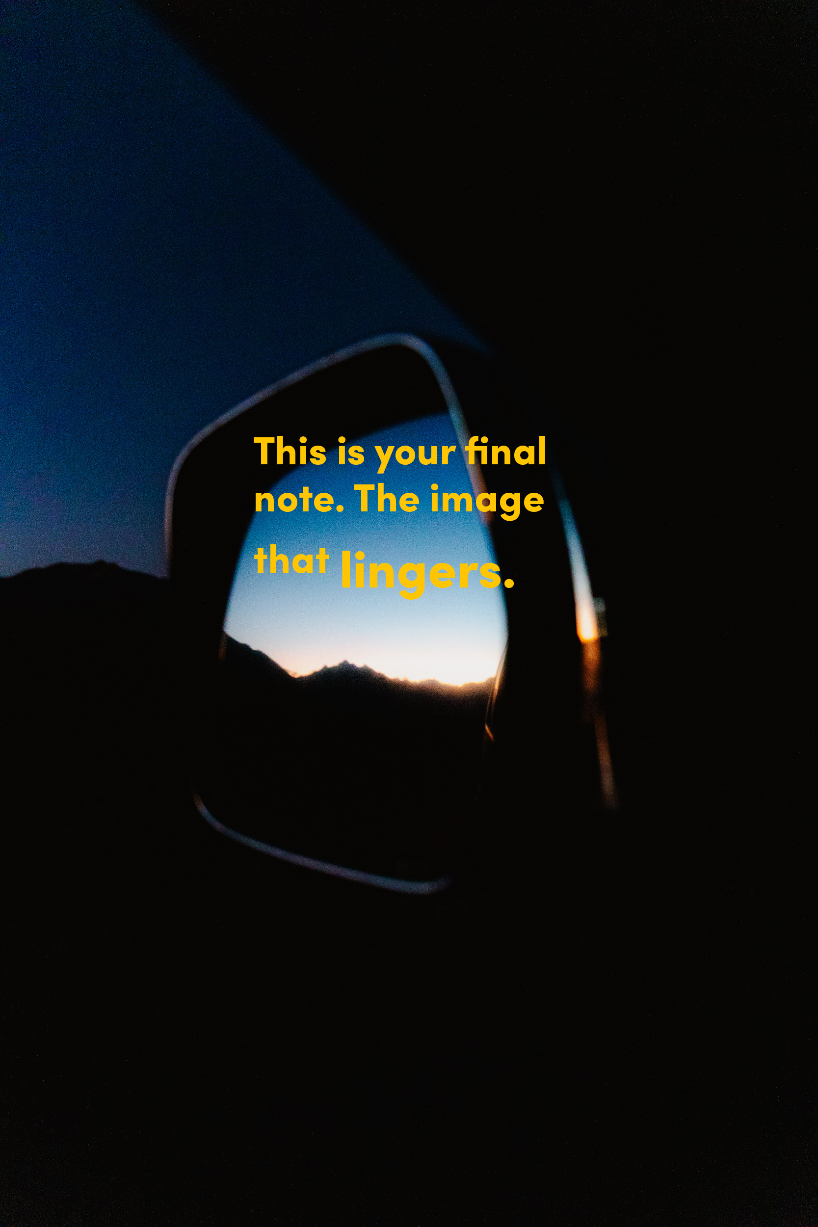
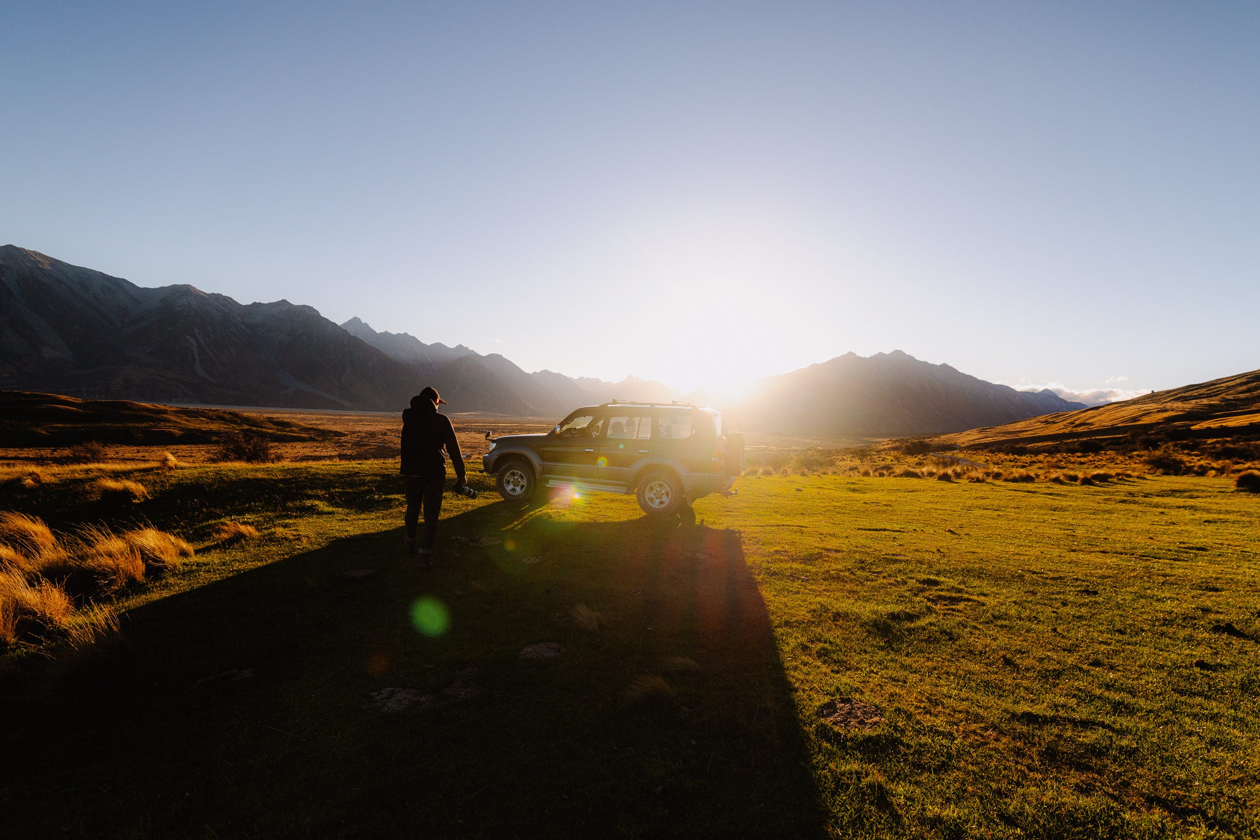
1. Start With The Cover & End Photos
Imagine each set is your mini zine or book.
Every good story has a beginning and an end. So I start my sets by choosing two images:
I’m thinking: what makes the reader want to pick this magazine off the shelf? What grabs their attention?
The Cover — This is your handshake. The one image that sets the tone. It should pull the viewer in before they even know what they’re looking at.
The Rear — This is your final note. The image that lingers. It should carry some kind of resolution—a breath out, a reward, a quiet moment, a finish line.
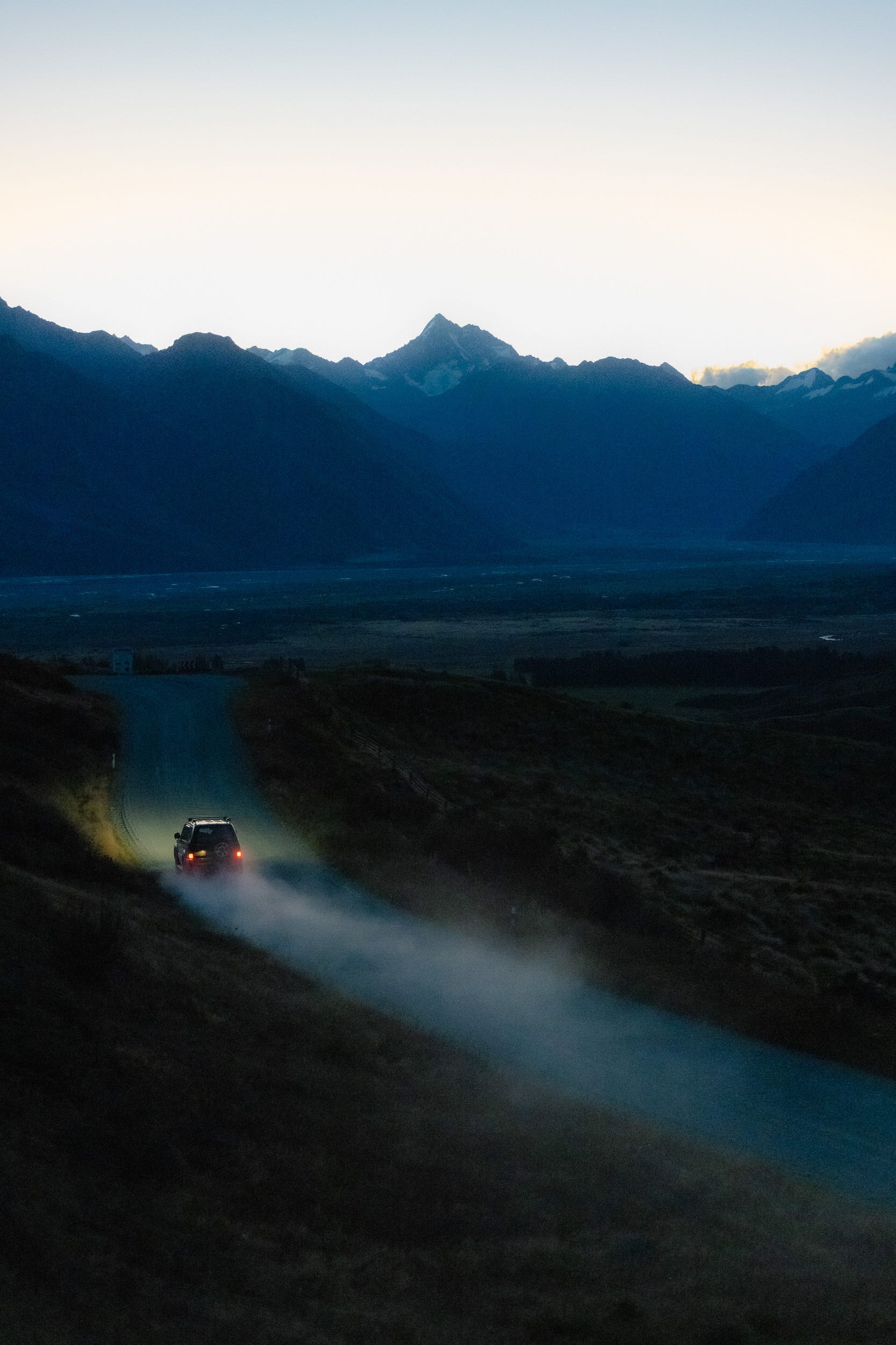
Once you have your bookends, everything in the middle becomes easier. You’re no longer just shooting or searching—you’re filling in the gaps between two moments
2. Story Blocks
This is my toolkit for the field. If you only take away one piece of the framework, this one is key. The following steps are merely notes that help me refine my accuracy even further—and only after I’d dialled in these five blocks as muscle memory.
Use the “Story Blocks” like chapters in a short visual novel. These aren’t rules; they’re prompts. Use what serves your narrative. You're the director here, and the final layout is unique to you.
Each one adds shape and tension. The goal: no flatlines.
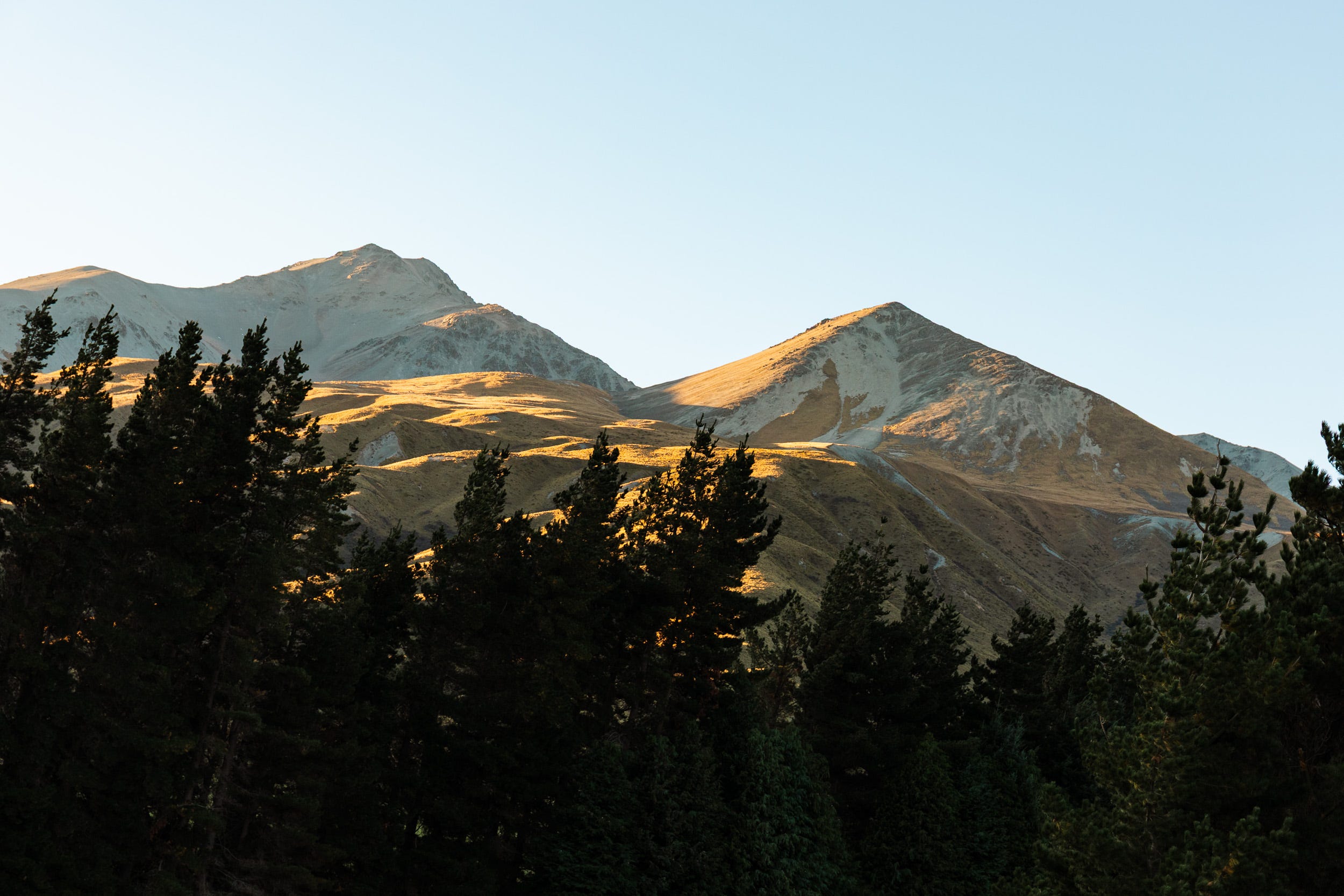
Wide — The establishment. Set the scene.
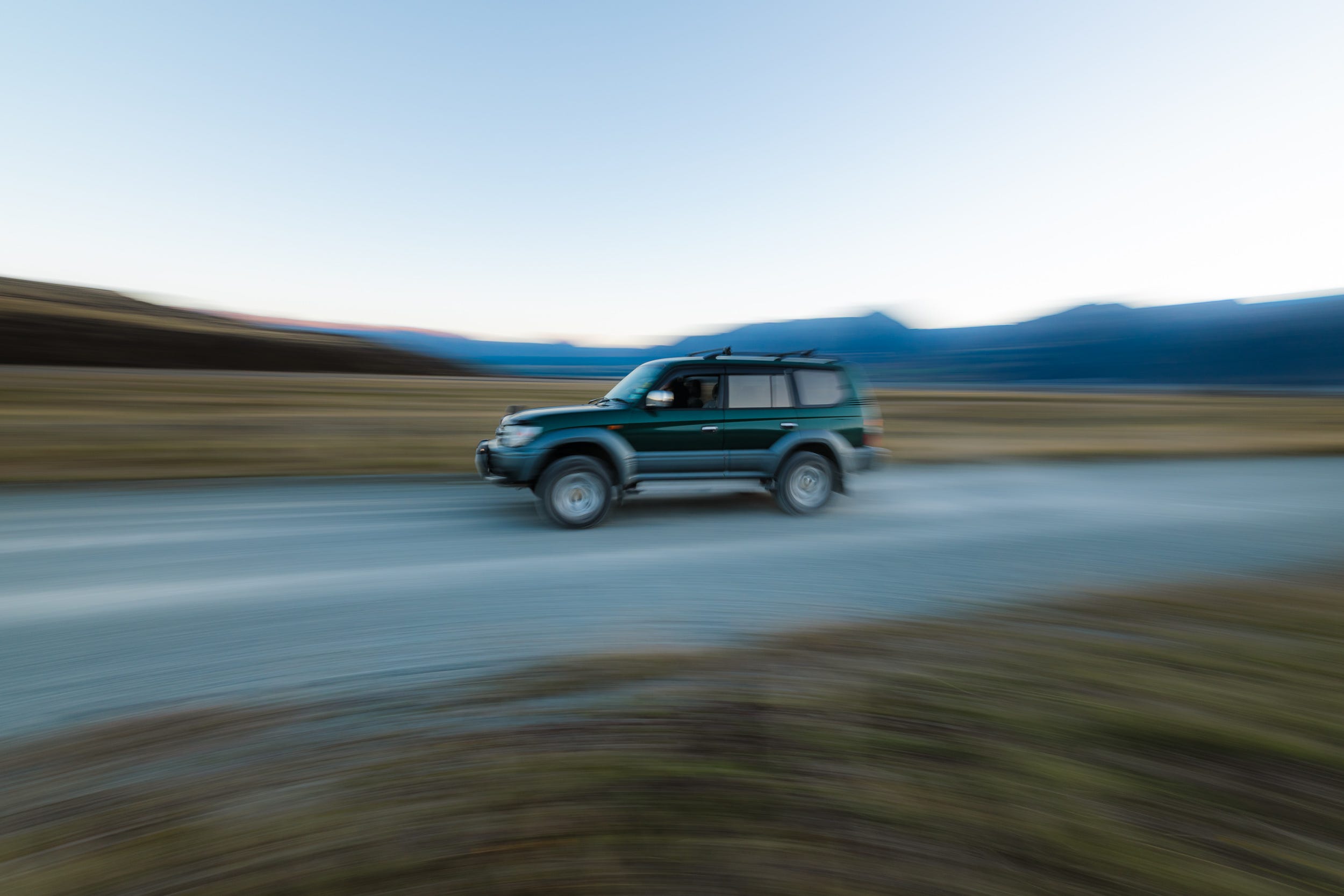
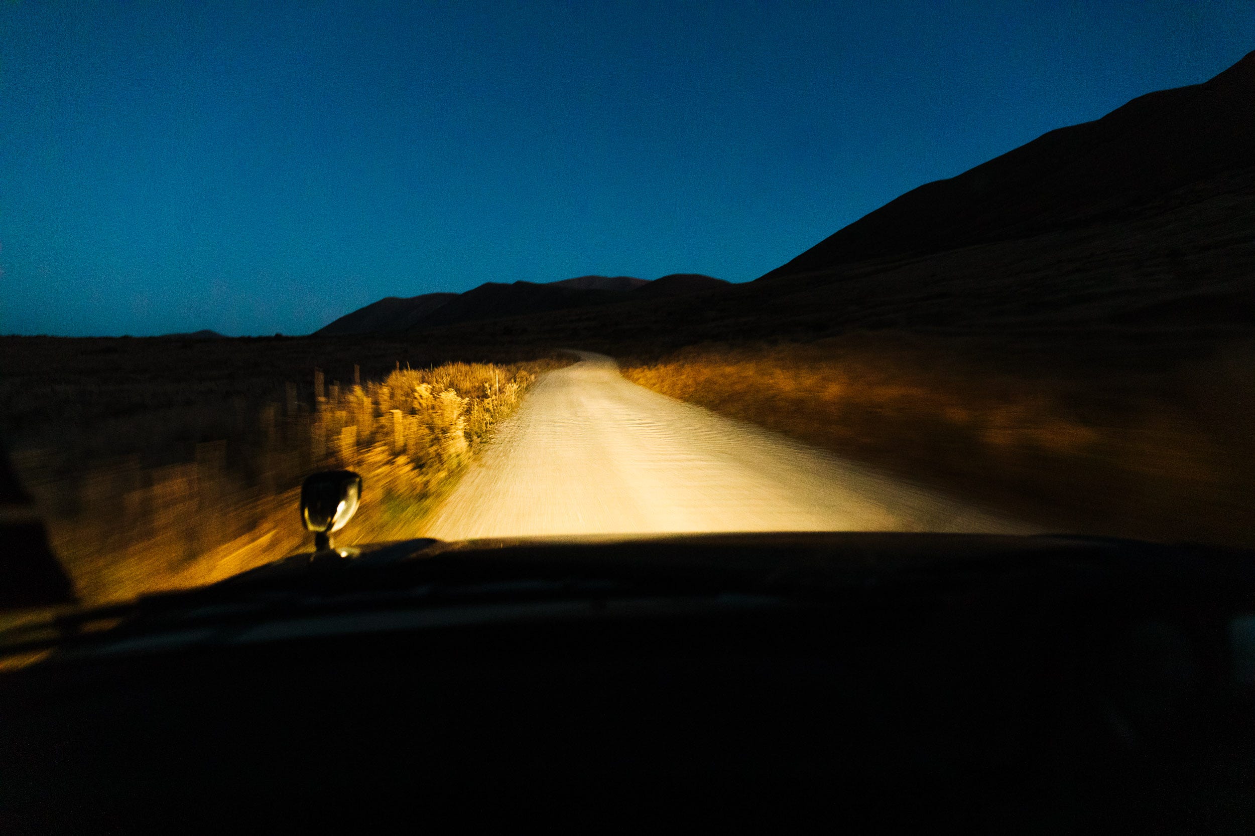
Action — Speed, movement, thrills, and effort.
Medium — Human element, lifestyle, gear.
Tight — Focus on the details, texture, and isolation.
Experiment, Unexpected, the Wildcard — Get creative.
These are the five internal building blocks of a strong set. They keep the story moving, dynamic, and honest.


Bonus Tip:
How I use Lightroom & filters for grading:
My first pass is brief—anything set-worthy is 3-stars and colour-tagged: Red (wide), Yellow (medium), Green (tight), Blue (action, experiment, cut-away).
Why only four colours? Because they are easy shortcuts on the keyboard: 6, 7, 8, and 9.
From there, I dial in on refining my set by using the colour filters to isolate each shot block and rating them 5-stars. (I use 4-stars as my fallback—should I want to drop anything out of 5-stars but don’t want it getting lost back into 3-stars—in case I need it again.)
This method allows me to hone in on the selection process without being distracted by the complete shoot, making sure I take at least one photo from each forward.
Lastly, I’m sure we’re all familiar with the grid layout (G) in Library View, which is great for a basic viewing of the whole set. But next time, check out Survey View (N). It helps quickly compare and select multiple photos side by side—not necessarily in order—making it easier to choose or reject the best shots from a group. It can be a tricky one to get your head around in terms of shortcuts, but it’s a powerful beast for making selects.
Here’s a video that goes a little more in-depth on Survey View HERE


3. Cut Anything That Doesn’t Push Forward.
If it doesn’t push the story forward—it goes.
This also means no repetition. Similar images only slow the viewer down.
Self-edit ruthlessly. Every image should move the viewer closer to your message.
Think like a filmmaker working with a short runtime.
4. Think in Series, No Singles.
This is what grabs attention and makes your work stick.
It’s what helps clients see your creative direction—not just your technical ability.
A tight 6–10 image set that works as a unit will land you more jobs than a portfolio of bangers with no flow.
It shows them you can pull off the storyline you pitched.


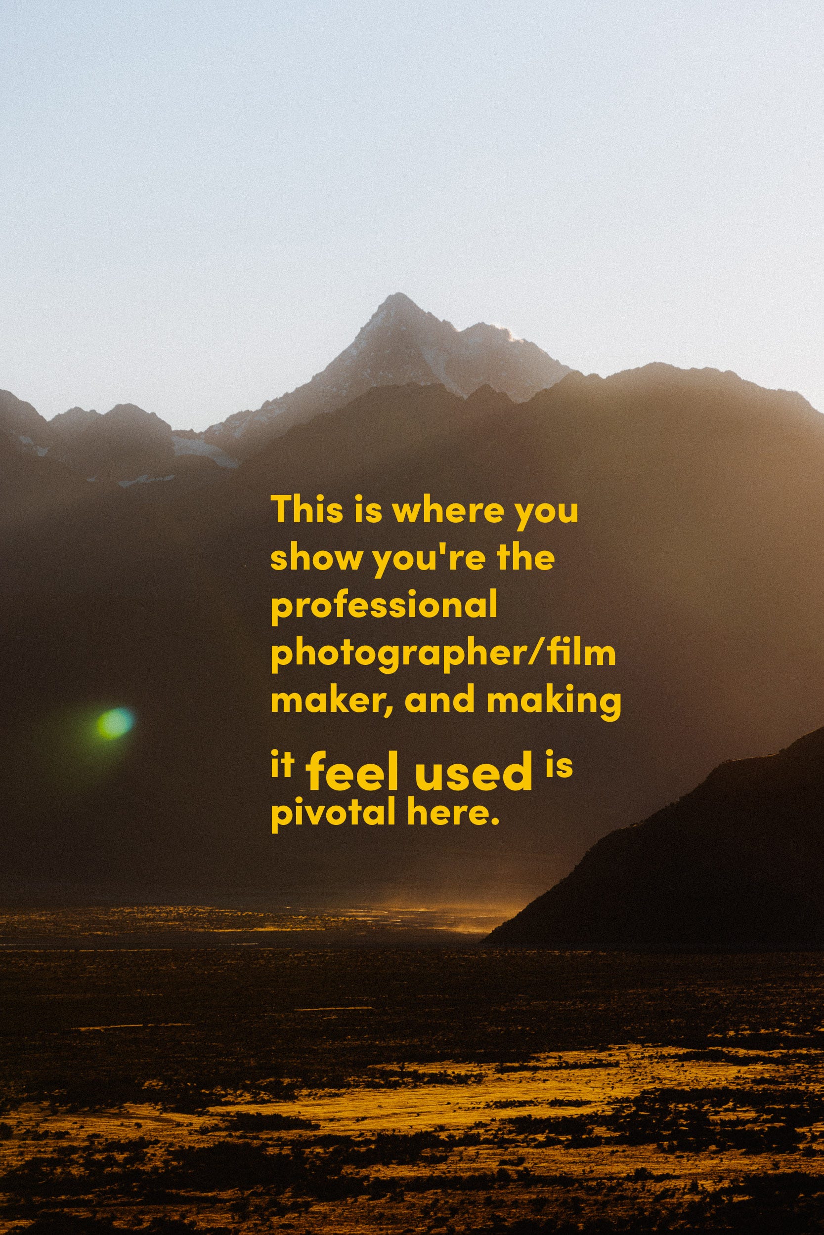
5. Make it Feel Used, Not Featured
Brands want to see it used. Make sure what is featured is being used for its worth — this is what resonates. There’s already enough competition in the featured department with influencer marketing. This is where you show you're the professional photographer/filmmaker, and making it feel used is pivotal here.
6. My Basic Structure, Made To Be Broken.
Instagram Carousel. The ideal set size: 5–8 photos.
Purpose: Tell a story in sequence. This could be a single outing, theme, or visual mood.
Online Portfolio. Ideal Set Size: 8–15 photos.
Purpose: Show depth, consistency, and range. Let the viewer live inside the story.
Long-form Story. Ideal Set Size: 15–25+ photos.
Purpose: Full immersion. Behind-the-scenes stories, print, zines or larger-scale projects.
Note: Even here, each image earns its spot.
07. Final Note: Everything Above Is Only A Guide.
If you made it this far, thank you! I hope you enjoyed a deeper insight into my own personal framework that gets it done in the field and sets me up for even better sets in post. Dive into an old catalogue — you might find you naturally cover every angle. You might unearth a large gap in your shot list that can now be filled.
The above framework is only a guide. It’s my approach that helps me keep laser-focused. Take the bits you like and bin the rest, or keep it all.
Choose your cover. Choose your rear. Then build from the inside out.
Join My New Subscriber Chat
Today, I’m announcing a brand new addition to my Substack publication: The Summary of Photography subscriber chat.
This is a conversation space exclusively for subscribers—kind of like a group chat or live hangout. I’ll post questions and updates that come my way, and you can jump into the discussion.
Let’s start with this framework. Let me know what parts you would take forward into your own flow—or let me know if you have your own tips you use. I’d love to hear them
How to get started
Get the Substack app by clicking this link or the button below. New chat threads won’t be sent via email, so turn on push notifications so you don’t miss conversations as they happen. You can also access chat on the web.
Open the app and tap the Chat icon. It looks like two bubbles in the bottom bar, and you’ll see a row for my chat inside.

That’s it! Jump into my thread to say hi, and if you have any issues, check out Substack’s FAQ.
Next Issue.
Love this deep dive Rich! Appreciate you breaking it down for me like that. I usually think that way with compiling stories in the magazine. Keep up the good work!
Superb advice, do you have a preferred order for the storyblocks?